Spotify Top 100 Yearly Playlist Analysis
Wesley, Why?
Every year Spotify comes out with our top 100 songs. Since I’ve been using Spotify from some time now, I have a couple playlists built up. I always wondered how my music taste has changed throughout the years. Wielding Spotify’s API and being able to access different Audio Features I thought it might be worth checking out.
Check out the GitHub repo
library(tidyverse)
library(ggdist) # Nice visualizations
library(patchwork) # Easy plot combinations
After using python to interact with Spotify (see Github) I downloaded my data and cleaned it up.
Let’s start coding
filepath_to_data <- here::here("content",
                               "post",
                               "2021-09-09-spotify_yearly_playlist",
                               "data")

playlist_2016 <- read_csv(here::here(filepath_to_data,
                                     "clean_2016_playlist.csv"))
playlist_2017 <- read_csv(here::here(filepath_to_data,
                                     "clean_2017_playlist.csv"))
playlist_2018 <- read_csv(here::here(filepath_to_data,
                                     "clean_2018_playlist.csv"))
playlist_2019 <- read_csv(here::here(filepath_to_data,
                                     "clean_2019_playlist.csv"))
playlist_2020 <- read_csv(here::here(filepath_to_data,
                                     "clean_2020_playlist.csv"))
Taking a look at one of our dataframes:
knitr::kable(head(playlist_2016))| song | feature | score | playlist |
|---|---|---|---|
| 1 | danceability | 0.674 | 2016 |
| 1 | energy | 0.667 | 2016 |
| 1 | key | 2 | 2016 |
| 1 | loudness | -7.385 | 2016 |
| 1 | mode | 1 | 2016 |
| 1 | speechiness | 0.0358 | 2016 |
Spotify’s Audio Features:
From The Spotify API Documentation we get a description of the different features.
acousticness- A confidence measure from 0.0 to 1.0 of whether the track is acoustic.danceability- Danceability describes how suitable a track is for dancing based on a combination of musical elements including tempo, rhythm stability, beat strength, and overall regularity. A value of 0.0 is least danceable and 1.0 is most danceable.duration_ms- The duration of the track in milliseconds.energy- Energy is a measure from 0.0 to 1.0 and represents a perceptual measure of intensity and activity.instrulmentalness- Predicts whether a track contains no vocals.liveness- Detects the presence of an audience in the recording.loudness- The overall loudness of a track in decibels (dB).speechiness- Speechiness detects the presence of spoken words in a track.tempo- The overall estimated tempo of a track in beats per minute (BPM)valence- A measure from 0.0 to 1.0 describing the musical positiveness conveyed by a track.
Wrangling!
Now some of the features are unrelated to what I want to look at so lets remove them
bad_features <- c("type", "id", "uri", "track_href", "analysis_url")

all_playlists <-
  playlist_2020 |>
  bind_rows(
    playlist_2019,
    playlist_2018,
    playlist_2017,
    playlist_2016
  ) |>
  filter(!(feature %in% bad_features)) |>
  mutate(score = as.numeric(score)) |>
  mutate(playlist = as.factor(playlist))
In order to plot, lets get our data into a wide format
wider_all_playlists <-
  all_playlists |>
  pivot_wider(
    names_from = feature,
    values_from = score
  )
Plotting
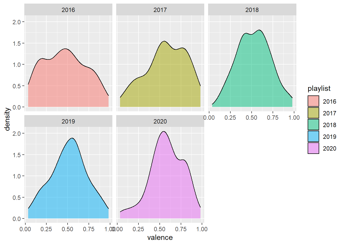
# Looking at the difference in valence
wider_all_playlists |>
  ggplot() +
  aes(x = valence, fill = playlist) +
  geom_density(alpha = 0.5) +
  facet_wrap(~ playlist)
Let’s break things down per-year
# Separating things
wide_2020 <- wider_all_playlists |> filter(playlist == "2020")
wide_2019 <- wider_all_playlists |> filter(playlist == "2019")
wide_2018 <- wider_all_playlists |> filter(playlist == "2018")
wide_2017 <- wider_all_playlists |> filter(playlist == "2017")
wide_2016 <- wider_all_playlists |> filter(playlist == "2016")
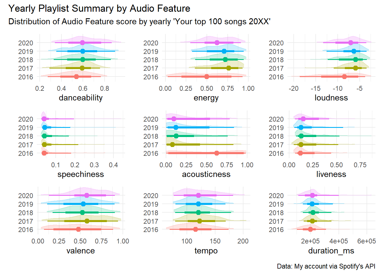
I want to create a similar graph for each variable so let’s get functional
audio_feature_graph <- function(data, audio_feature) {

  # For passing in columns into function
  feature <- sym(audio_feature)

  plot <- data |>
    ggplot() +
    aes(x = !!feature, y = playlist, color = playlist, fill = playlist)

  plot <-
    plot +
    stat_slab(
      size = .5,
      alpha = .2
    ) +
    stat_halfeye(fill = "transparent")

  plot <-
    plot +
    theme_minimal() +
    labs(y = "") +
    theme(
      legend.position = "none",
      plot.title = element_text(hjust = 0.5)
    )

  return(plot)
}
Aaaaaaaaand map!
all_audio_features <- c(
  "danceability", "energy", "loudness", "speechiness",
  "acousticness", "liveness",
  "valence", "tempo", "duration_ms"
)

all_plots <- all_audio_features |>
  map(~ audio_feature_graph(wider_all_playlists, .x))
Add some description
all_plots <-
  wrap_plots(all_plots) +
  plot_annotation(
    title = "Yearly Playlist Summary by Audio Feature",
    subtitle = "Distribution of Audio Feature score by yearly 'Your top 100 songs 20XX'",
    caption = "Data: My account via Spotify's API"
  )

all_plots
Using the correlation package
The correlation package is apart of easystats and allows for easy correlation analysis (go figure)
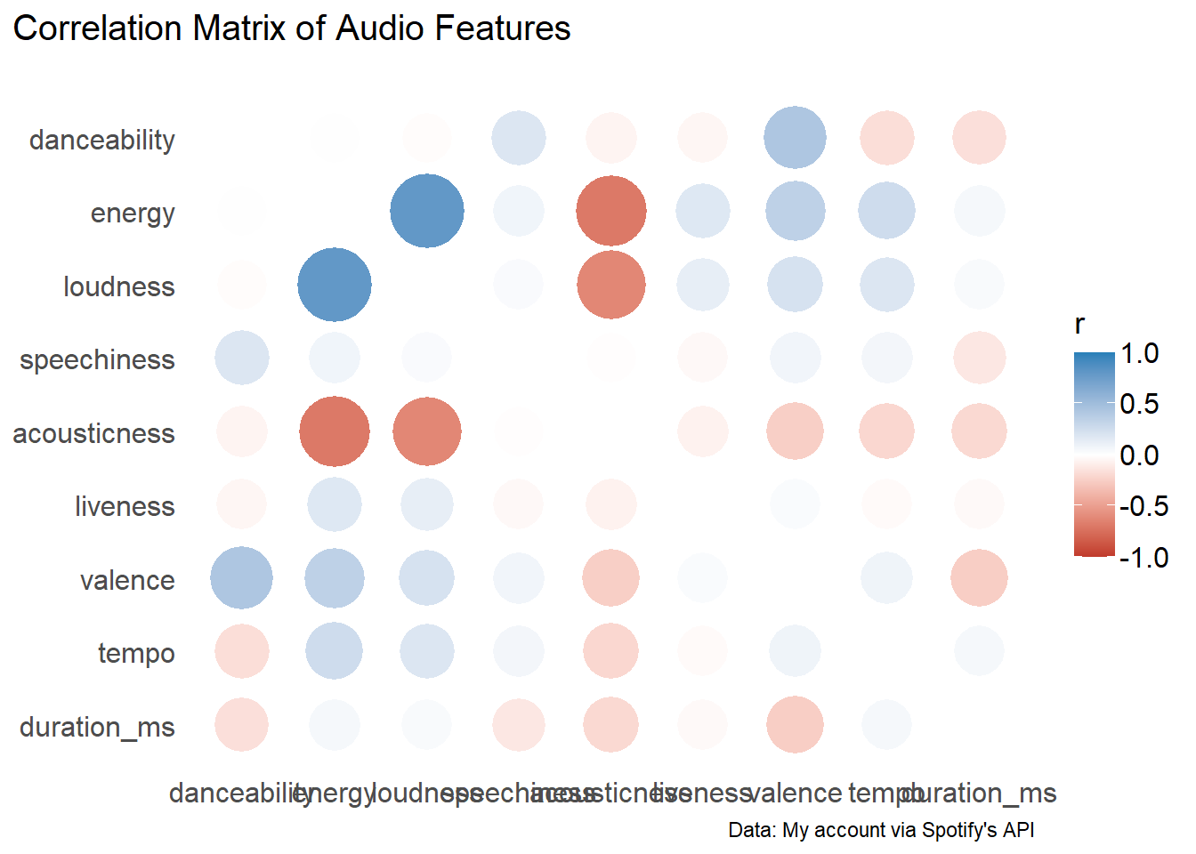
Let’s look at a correlation matrix
library(correlation)
library(ggraph)

results <- correlation(
  wider_all_playlists,
  select = all_audio_features
)

corr_matrix <- results |>
  summary(redundant = TRUE) |>
  plot() +
  labs(
    title = "Correlation Matrix of Audio Features",
    caption = "Data: My account via Spotify's API"
  )
corr_matrix
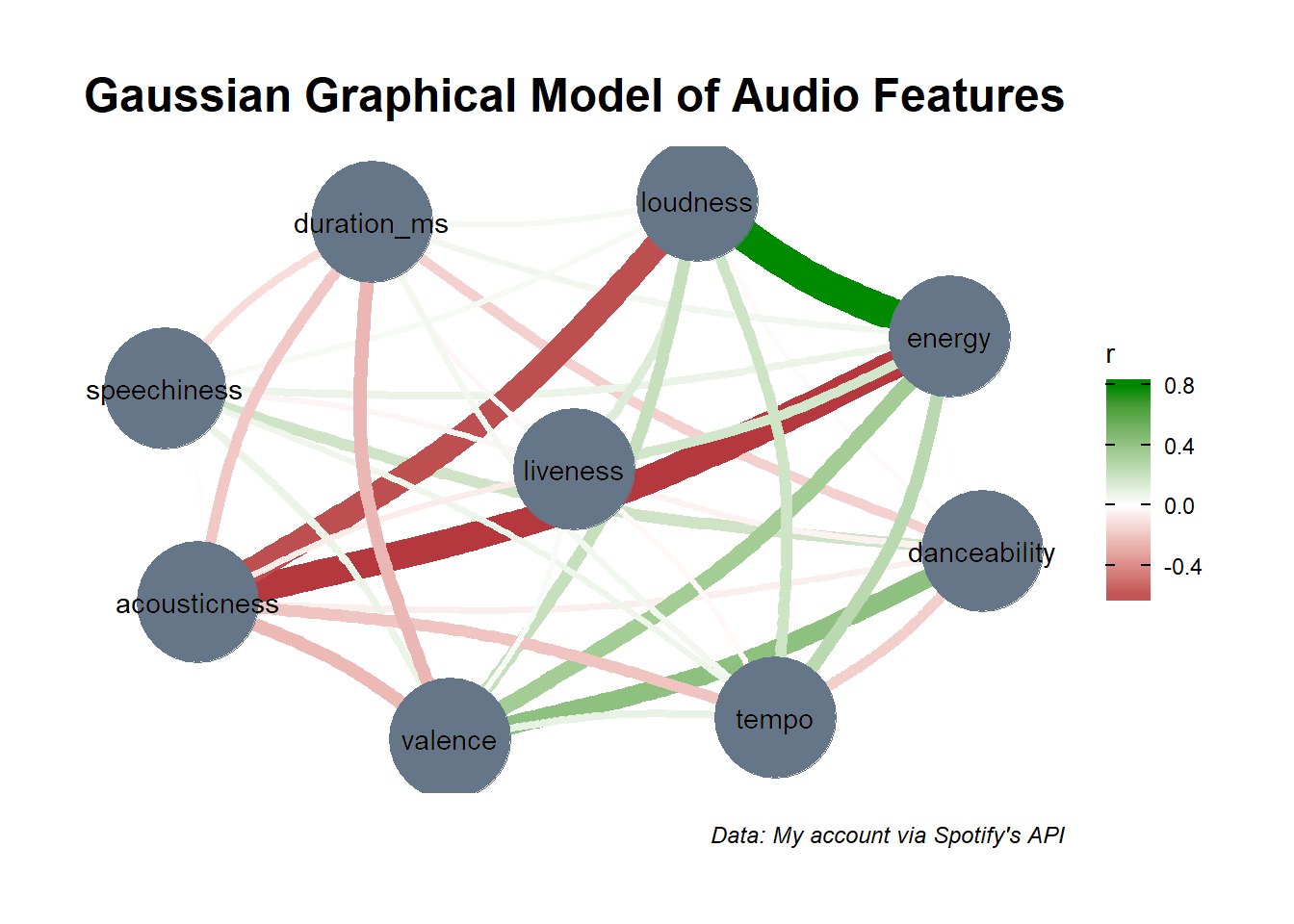
We can also make a Gaussian Graphical Model (GGM) of our data.
ggm_graph <- results |>
  plot() +
  geom_node_text(label = all_audio_features, color = "black") +
  labs(
    title = "Gaussian Graphical Model of Audio Features",
    caption = "Data: My account via Spotify's API"
  )
ggm_graph
Conclusion
This was a fun little activity to look at how my music taste has changed over time on Spotify.
Reference
Makowski, D., Ben-Shachar, M. S., Patil, I., & Lüdecke, D. (2019). Methods and Algorithms for Correlation Analysis in R. Journal of Open Source Software, 5(51), 2306. doi:10.21105/joss.02306